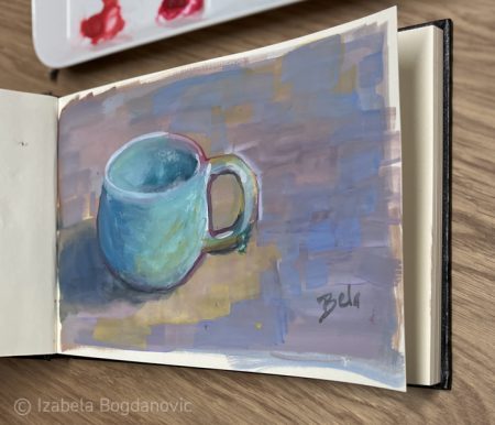
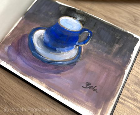
In the spirit of all things new I wanted to art something new so I experimented with gouache. I did a really simple study of a mug on my desk, the only thing in view while sitting next to a humble porcelain plate palette.
Well, I have noticed with great displeasure, that it is not oil paint. While this may sound self-explanatory, after years of painting a certain way and having to change this process is just a strange experience (but I was going for that anyway).
It feels just wrong to have to entice colour with water to get on your brush, but if you use too much water it will lose the intensity. Not even mentioning that it all looks darker when wet, and I hope you are not planning to paint anything brown because it looks literally like mud. That being said, this medium is not fussy when it comes to preparation and finishing. You can paint in a sketchbook and just close it once you finished. This relaxed attitude is just a funny aspect of the process being that you had to labour so much to get the paint on the paper.
The next surprise happened when I reopened my sketchbook the following day: it looked better than when freshly painted, having lost that touch of muddiness and wet darkness.
I am using a limited palette (for a change) that is somewhat different than my oil one as I removed cadmiums and cobalts as the binder in watercolours is too loose for my taste and I do not want pigment particles flying around.
I am a great admirer of colours, I love all colours with great passion and I use them all from time to time. Having to limit the colours I use regularly is just a practical solution to the impossible idea of having them all play a part in each painting.
That is why I developed a system that works for me: I have some regular colours and the special guest stars for a particular painting project.
I was always so curious to see what kind of colours other artists are using so I am sharing my set of the most often chosen colours with one note: I do not promise that I will not change these on a whim. I often ponder to just ditch the most practical colours and use only the colours I truly love. For example, although permanent alizarin crimson is the most practical solution who says I will always want to be practical… Maybe one day I will decide that practical is not my thing and pursue only the colours that I am crazy about. I think that day will surely come and that will be interesting to see.
This is my basic oil painting palette, my main colour stars:
White
Cadmium yellow light (I do not like this colour, it is in danger of disappearing from my list)
Cadmium yellow medium
Yellow ochre
Cadmium orange deep
Cadmium red light
Permanent alizarin crimson (this is a boring colour)
Ultramarine blue
Cerulean blue
Phthalo green (this colour is a bully)
Transparent oxide red (there is no black without this one)
Terra rosa (what I said about phthalo green)
I do not really believe in limited palettes. Why would you want to limit yourself with colours? That would be like if a writer used only one set of words and combined them till the end of time. That sounds very taxing to me. I see how limiting colours can be beneficial for some artists but we are all so delightfully different, aren’t we?
I haven’t listed the special guest star colours, but you can go have a look at the variety offered by paint manufacturers to get that exact list 😁 (I see no point in listing you an entire catalog).
I am currently auditioning different violets, as I will be adding a regular violet once I have established which one that is. I guess in a couple of years, it takes me a while to make these decisions and even then their fate is uncertain. I am currently leaning towards Mars Violet.
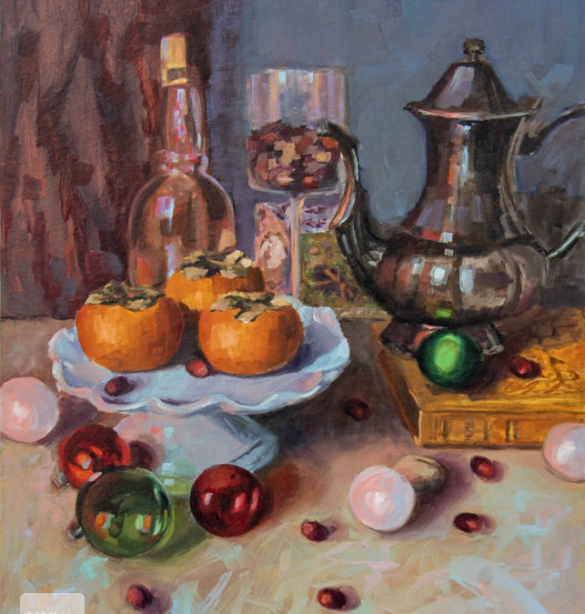
You can see me here still using a violet I mixed from ultramarine blue and alizarin crimson.